

Dollhouse 002 – In Which We Get Weird with Wallpaper And Rugs
a monthly interiors column encouraging you to unleash your inner freak


This email may be too long to view in your browser — be sure to hit “expand” or read in the Substack app so you don’t miss out on anything!
Today’s newsletter is free. Consider liking, commenting, and sharing Trash Panic with someone you think might enjoy it! Paid subscriptions support the time (many hours!) and care (so much care!) that go into creating magic in this corner of the internet while also giving back to community focused causes.
This month, a portion of paid subscriptions will go to Pal Humanity, a global initiative led by two Palestinian female doctors offering immediate relief and sustainable support to the people of Gaza.
If you make a purchase through a link in this month’s Dollhouse, I might earn a small commission, which will also be donated to Pal Humanity.
Anya Kordonowy is Trash Panic’s monthly columnist focusing on weird-wacky-wonderful-whimsical design, interiors, and thinking about the facets of visual beauty beyond the Pinterest board. You can catch up on her first dispatch here, and follow her elsewhere on the internet here, here and here.
Okay my Dollhouse babes, I’M BACK. HI! It feels at once a lifetime since my inaugural appearance in Trash Panic and also, a split second. Summer moves at a different pace and it takes me until about August 29th to get used to it, just in time to slow back down. But here we are, sweaty armpits and all.
Aptly, today we’re dipping our toes into the world of ornament, ornamentation, ornamental decorating… I named my company ‘Ornament’ for a reason… it’s a realm I’m particularly passionate about and happen to feel cozy in. And it’s a world that can get real weird in a really good way.
Specifically we’re going to touch on RUGS and WALLPAPER today, two of my favorites. Why? You might ask. Well, because my (THE) Patron Saints of design and decorating, Christopher Alexander & Josef Frank think they’re both really good for your soul and I agree with them. Excuse the professorial take here but, see below:
“A surface with a single color feels nervous, a patterned one relaxing, as the observer is involuntarily affected by the slow, calm way in which one perceives it. It is impossible to fathom a wealth of ornamentation quickly, whereas, on the other hand, it takes no time to grasp a surface with a single color, and so it offers nothing of further interest. Someone sitting on a Persian carpet becomes calm… A carpet with only one color has the opposite effect.”
Josef Frank, ‘Rooms and Furnishings’ 1934
and also
“All people have the instinct to decorate their surroundings. But decorations and ornaments will only work when they are properly made: for ornaments and decorations are not only born from the natural exuberance and love for something happy in a building; they also have a function, which is as clear, and definite as any other function in a building. … Ornaments are not just optional additions which may, or may not be added to a building, according as the spirit moves you – a building needs them, just as much as it needs doors and windows.”
Christopher Alexander, ‘A Pattern Language’ 1977

Thanks for humoring me but c’mon, I think that’s science, right? A lot of my clients tend to be frightened by the idea of utilizing multiple patterns, multiple textures, multiple colors, but it’s in our DNA to look for those ‘ornaments’ around us to calm us. Think about taking a walk in the woods in July in Minnesota - all the flowers in all the colors in full bloom, trees of every height and variety leaning and swaying filled with varying tones of green leaves - layers upon layers of pattern, color and if dissected - perhaps you’d describe it as pure fucking chaos? And yet it feels so calming and we seek it out, so why not bring a bit of that into our homes?
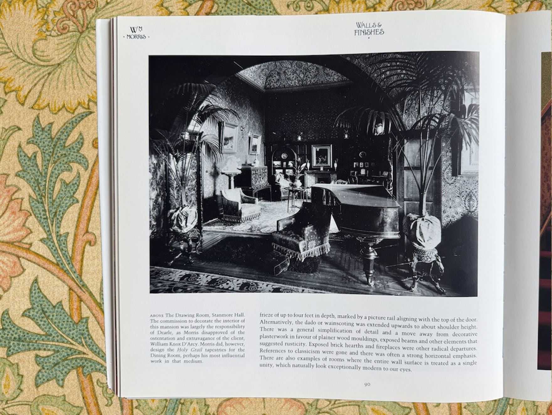
I always refer to these images in one of my all-time favorite books (ever) on William Morris (or anyone) when clients get nervvy about spaces feeling like too much. Look at these!! Like really look at them. We’ve got stenciled trim, patterned ceiling (stencil or wallpaper, I can’t tell), wallpaper from floor to ceiling, many multiple patterned upholsteries, multiple rugs on top of each other, drapery here and there, not to mention all the furniture, bedding, photos, CAMELS, etc etc, the list goes on!
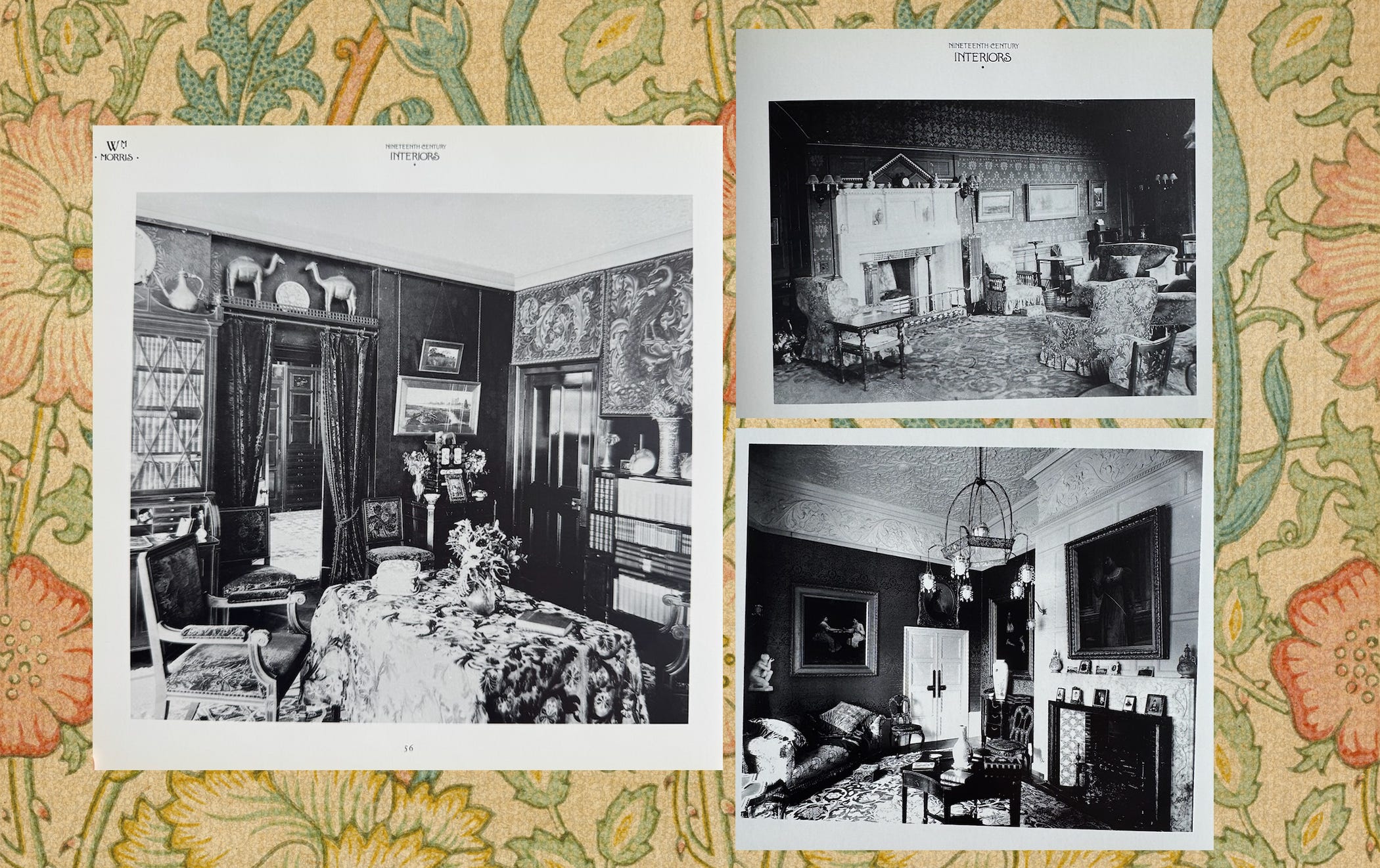
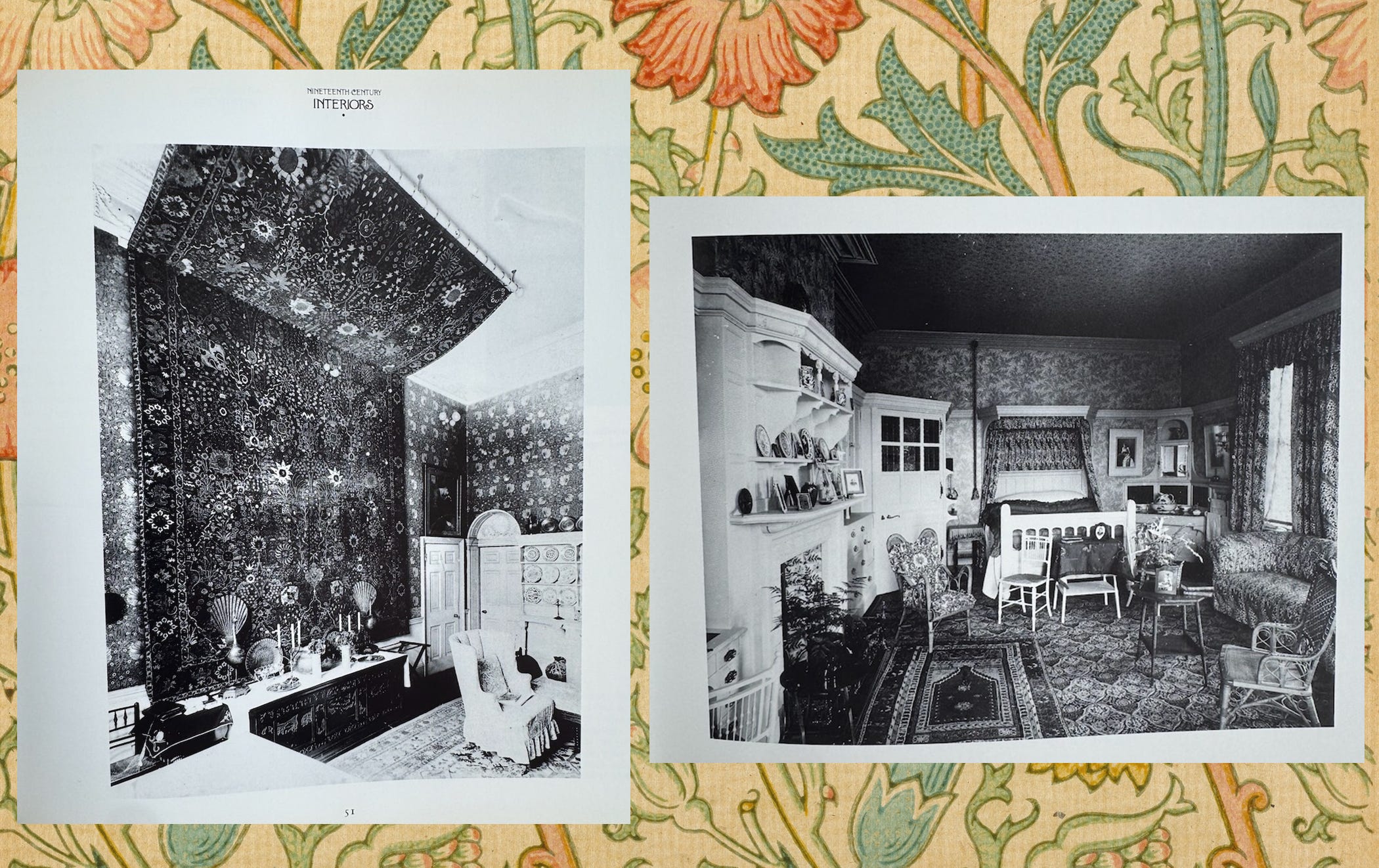
Do I think you need to make your space into the living room or bedroom of a Brit in the 1890’s? No. But, we love nostalgia. We save the images on Pinterest. We save the images on Instagram. We screenshot and document these old spaces and I think these spaces still speak to us nearly 150 years later because they exemplify a feeling of Cozy Home. A lived in and alive Cozy Home. And what makes it feel lived in and cozy? I think it’s the gathering and collecting of the textures, patterns, colors (imagine if these images were in color!). It’s the way it feels like it came together by itself to be the perfect spot to take a rest.
The point isn’t to copy this, not at all. The point is to give you an example (I have more if you need more!) of how incorporating many patterns, textures, colors in one space can be exactly what your Home Soul needs and it’s possible for you to do it and love it. And two of my favorite ways to play around with this idea is wallpaper and carpet because they’re inherently patterned and textural and colorful and thanks to the internet we all have access to a million versions of that while we wait for our coffee in the morning.
Here are 5 combos of wallpaper + rugs + paint colors if you need proof. **Please note that these combos are quintessentially Me. Pretty loud and wacky, inner freak on display. But you can turn the volume up or down on this theory by tuning the color or tone, saturation and texture. Find a comfortable color scheme (it’s okay if it’s pastels! Or neutrals!) and grow it from there but don’t be afraid to add what feels like one too many, it might just be the missing ingredient.
COMBO ONE
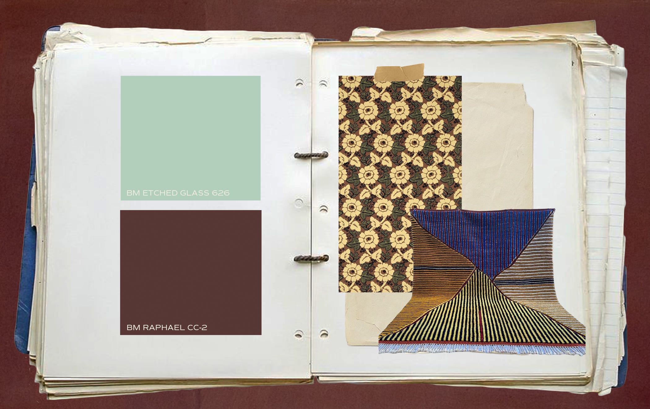
🌀 BENJAMIN MOORE ETCHED GLASS (626)
🌀 BENJAMIN MOORE RAPHAEL (CC-2)
🌀 ADELPHI PAPER HANGINGS CHESTERTOWN VINE WALLPAPER (various color combinations available)
🌀 MOROCCAN PRISM RUG (various sizes available)
COMBO TWO
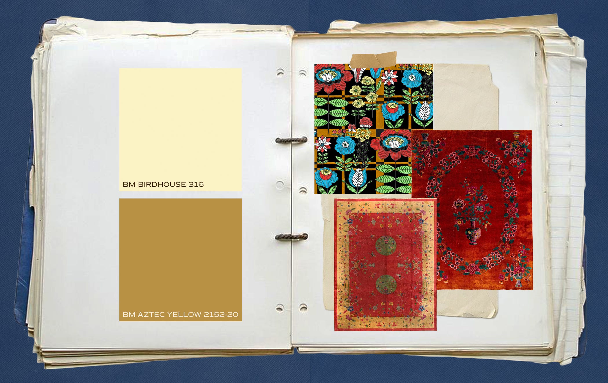
〰️ BENJAMIN MOORE BIRDHOUSE (316)
〰️ BENJAMIN MOOR AZTEC YELLOW (2152-20)
〰️ VOUTSA PLAID BLOOMS TECHNICOLOR WALLPAPER
〰️ ANTIQUE FLORAL VASE CHINESE ART DECO RUG (available on auction)
〰️ ANTIQUE CHINESE ART DECO RUG (available on auction)
COMBO THREE
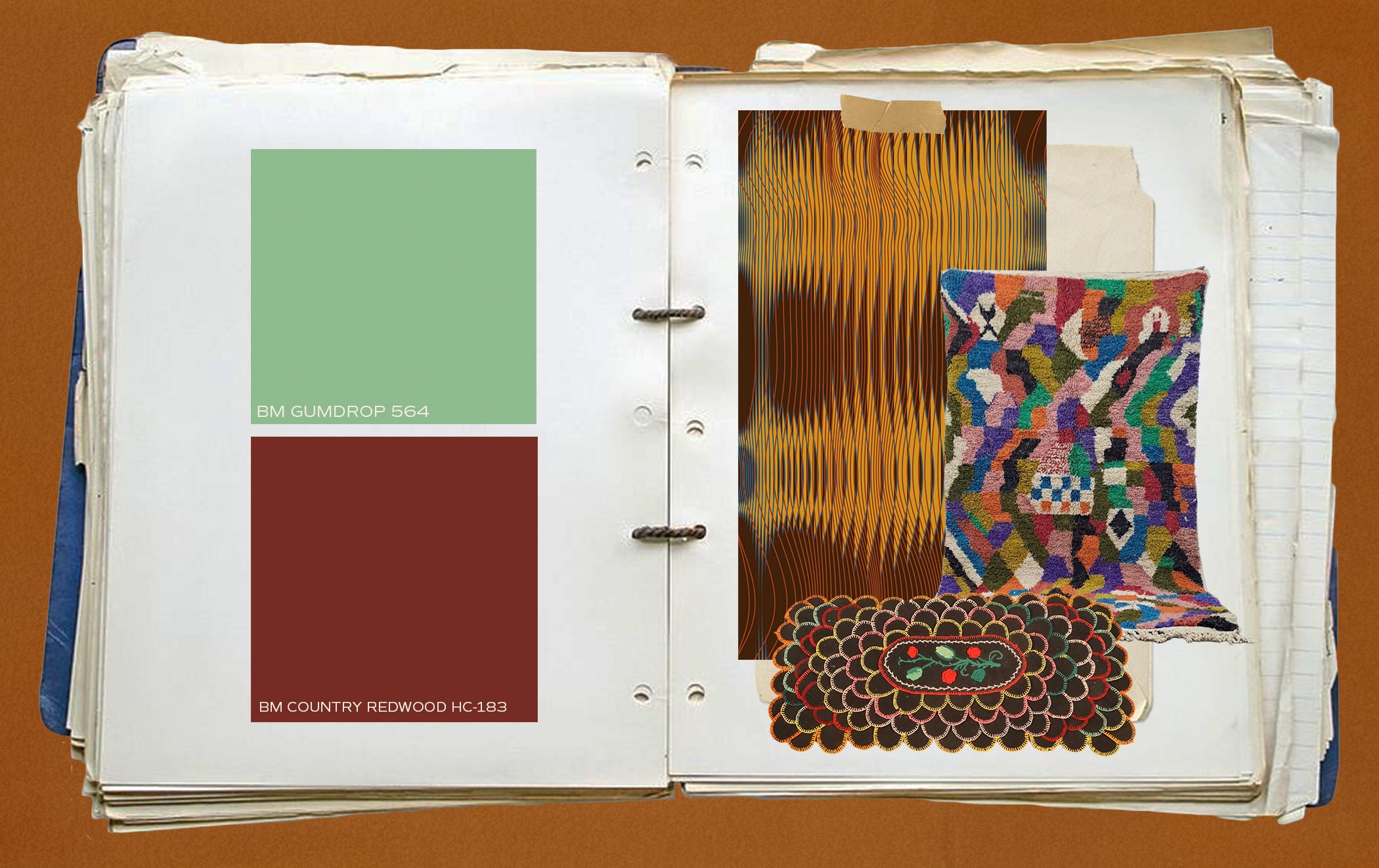
🌀 BENJAMIN MOORE GUMDROP (564)
🌀 BENJAMIN MOORE COUNTRY REDWOOD (HC-183)
🌀 BRADLEY L BOWERS RIPPLE OCHRE WALLPAPER
🌀 COLORFUL ABSTRACT MOROCCAN RUG
🌀 ANTIQUE FOLK ART SCALLOP RUG
COMBO FOUR
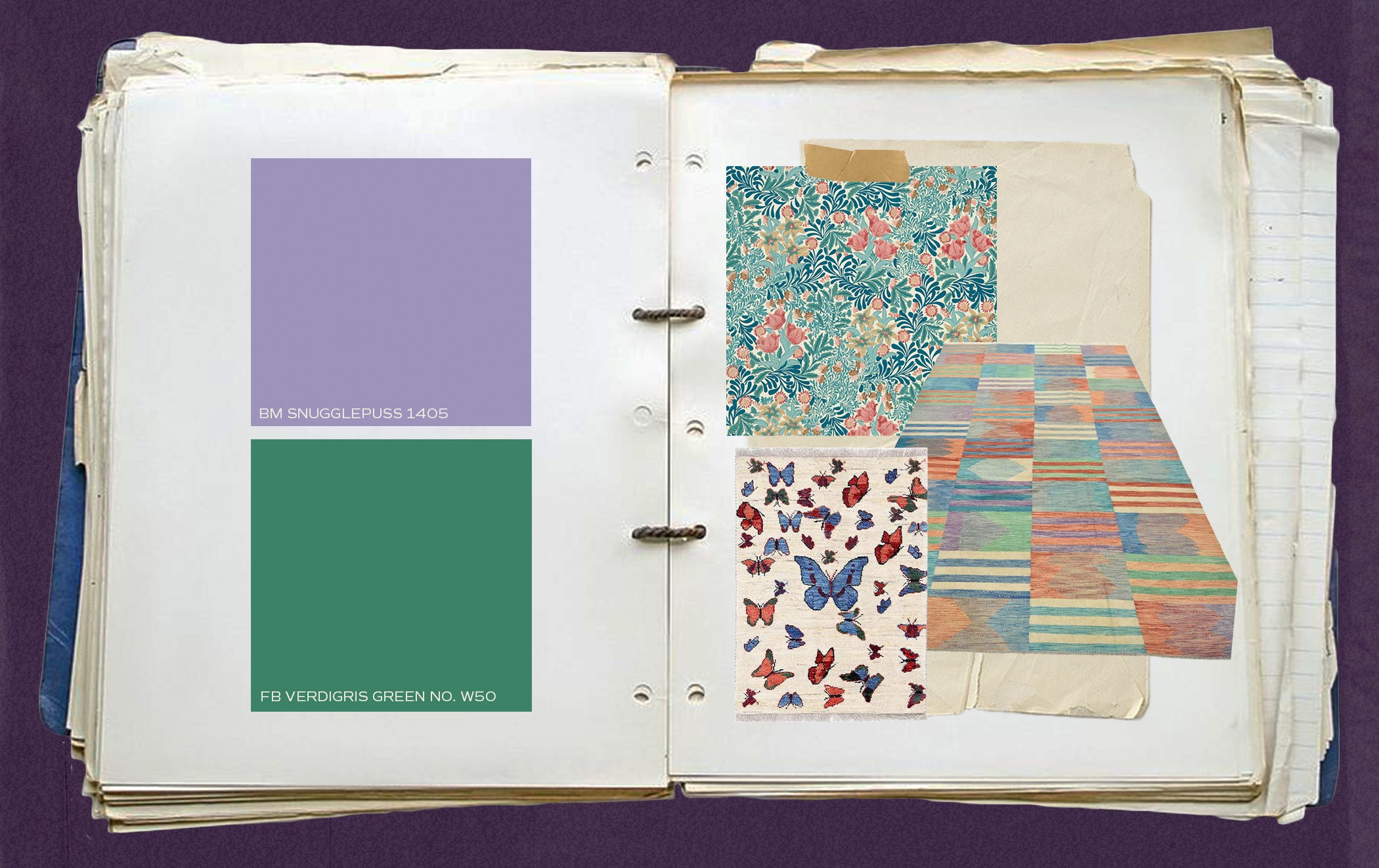
〰️BENJAMIN MOORE SNUGGLEPUSS 1405
〰️FARROW AND BALL VERDIGRIS GREEN
〰️MORRIS & CO BOWER - INDIGO/BARBED BERRY WALLPAPER
〰️HAND KNOTTED PERSIAN BUTTERFLY RUG (available on auction)
〰️STRIPED GRADIENT RUG
COMBO FIVE
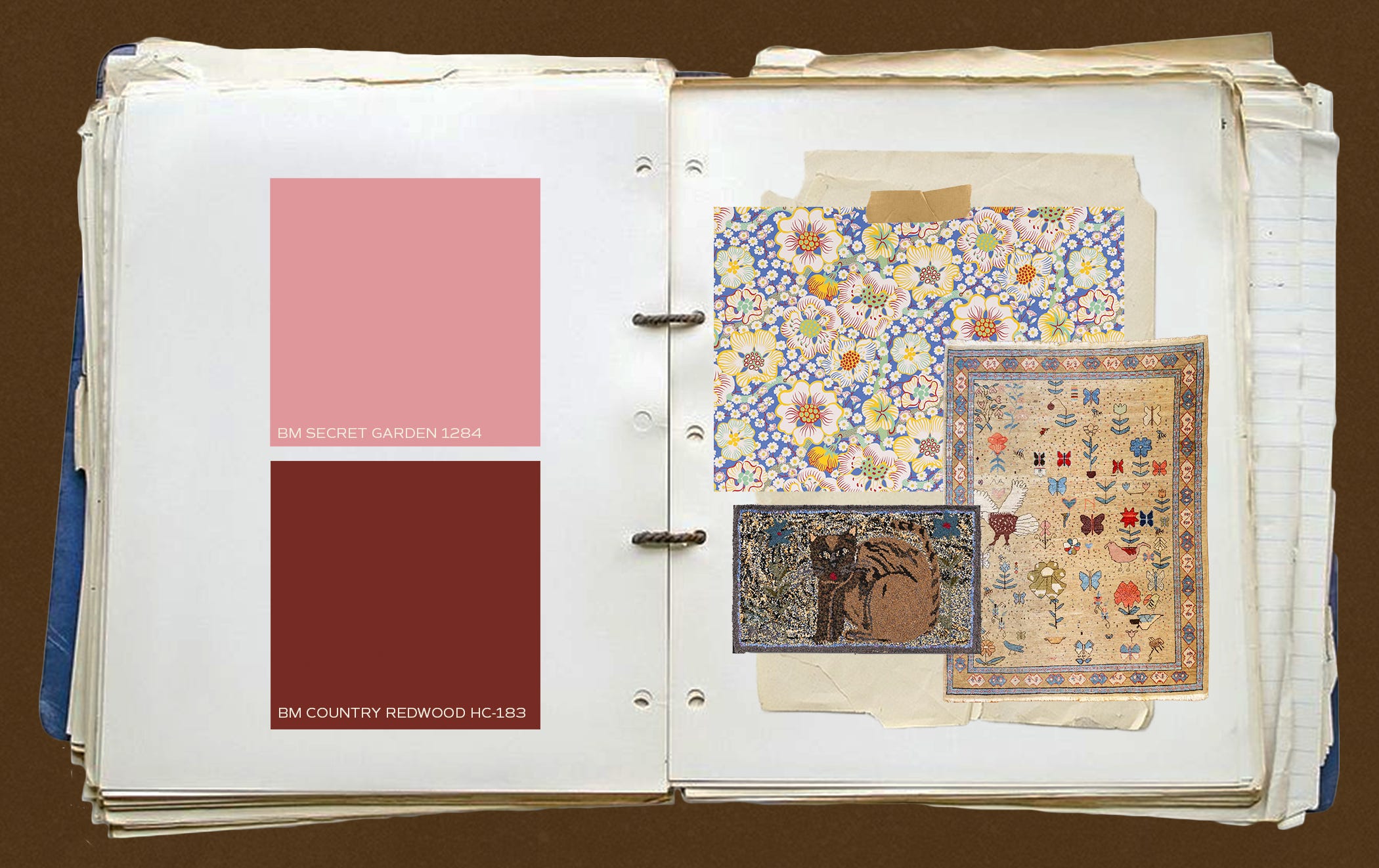
🌀 BENJAMIN MOORE SECRET GARDEN (1284)
🌀 BENJAMIN MOORE COUNTRY REDWOOD (HC-183)
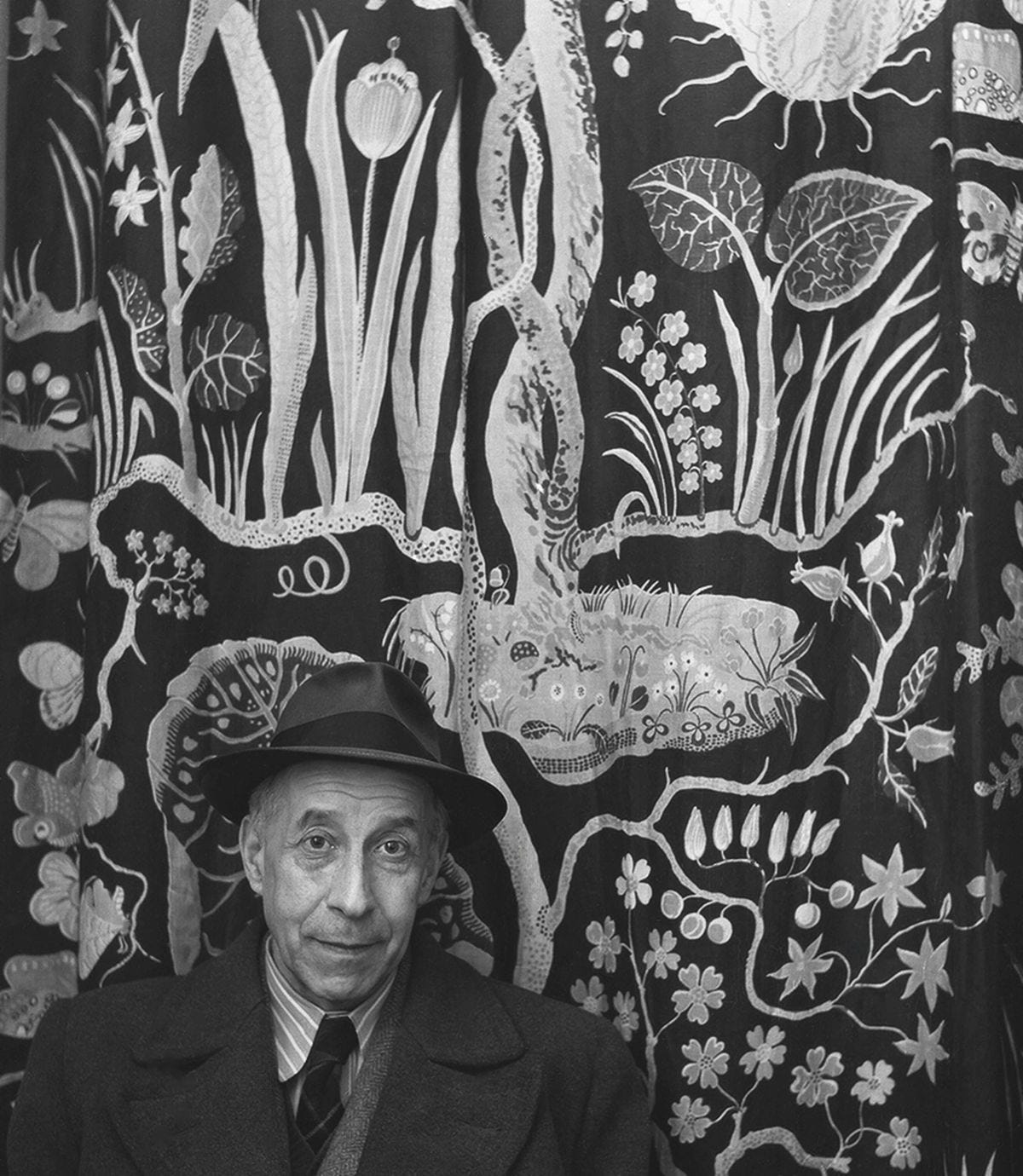
🌀 JOSEF FRANK’S BLUE WALLPAPER ELDBLOMMAN
🌀 TURKISH AZURI RUG (sold at auction, browse the related items!)
🌀 FOLK CAT HOOKED RUG (sold at auction, search “vintage folk art” and see what you find!)
IMO, within the ever changing landscape of whatever “interiors” is, the best design has always been about what Josef Frank coined as Accidentism which is, according to him, the idea that we should design our spaces to feel as though they happened on accident (I will expound on that another time!). I think finding the weird balance of the edge of “too much” is a way to bring us closer to that accidental greatness that is the house your grandmas best friend decorated herself that felt completely unhinged and yet somehow completely comfortable and perfect.
Until next time my Trash Head Kweens, please dive into the combo links! Glenn tells me people like links! Some of these goodies aren’t around anymore but perhaps these will lead you down the rabbit hole of weird… If you buy something let us know how you used it and where you put it! And is it scary? Or did it make your space downright cozy af?
☻♥ Anya
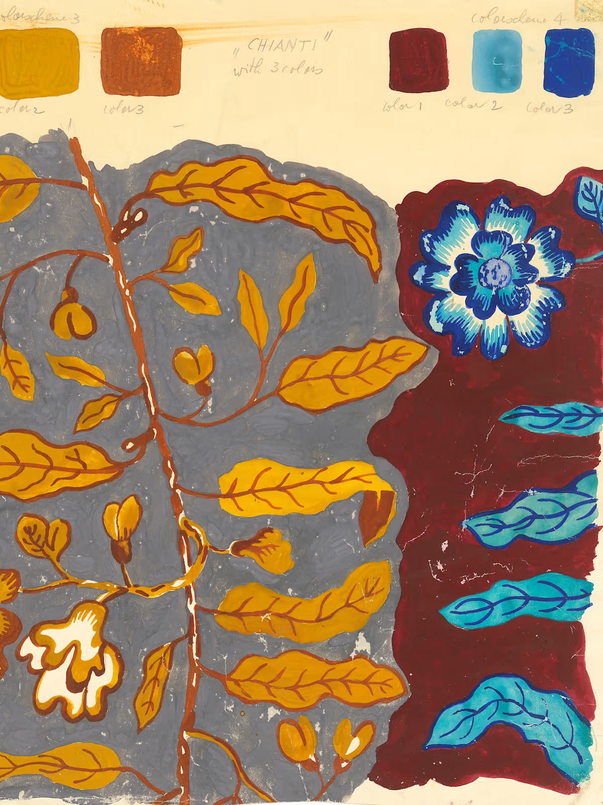
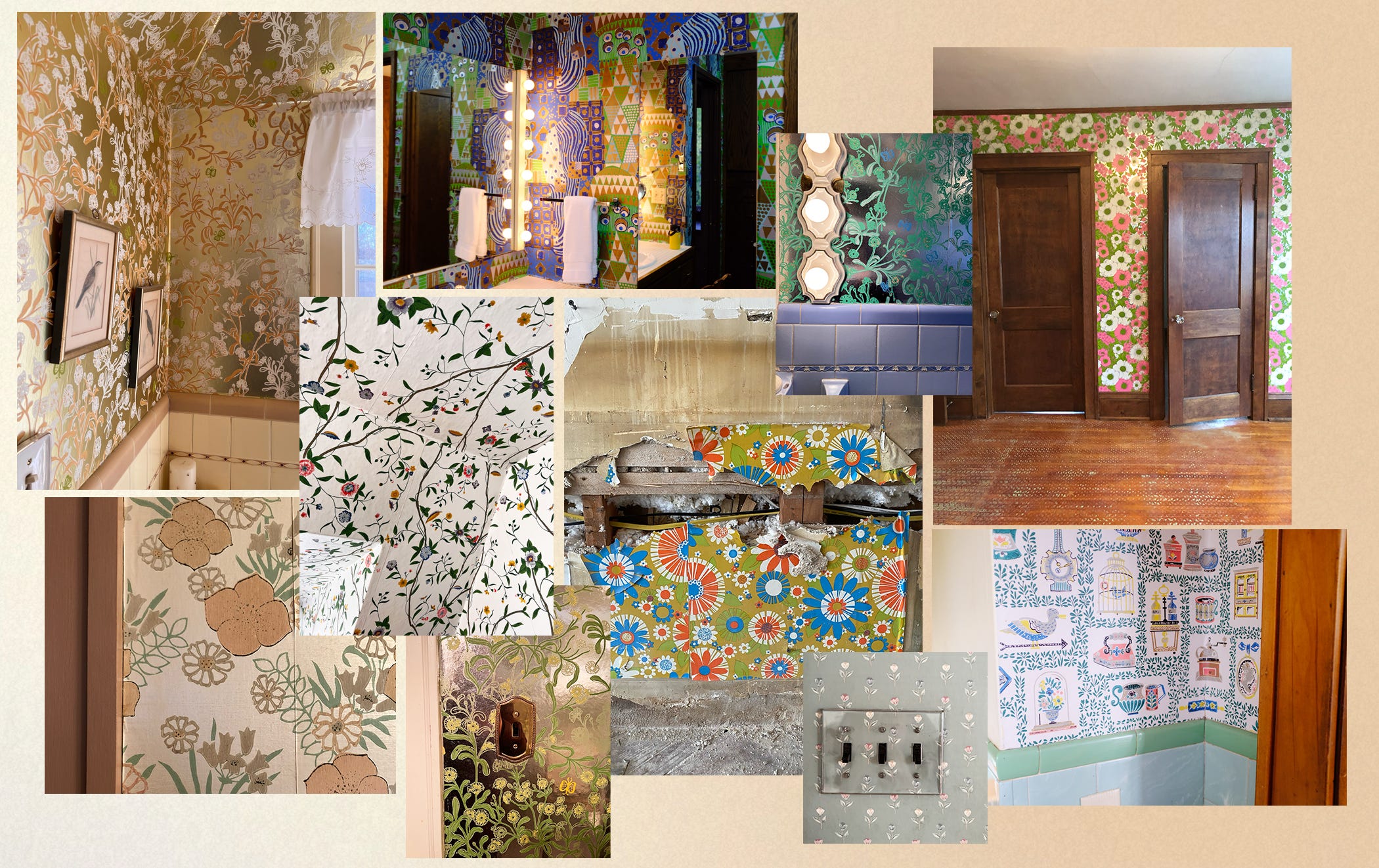
P.S. If you need further proof of my level of crazy for wallpaper in particular, here are three links to vintage wallpaper and paint color sample books that I might have won that were in a live auction that I may have been in for nearly 6 hours on Sunday while also parenting… peeks into these at a later date! Oh and one I didn’t win, but ALMOST PAID $500 FOR…
P.P.S. Enjoy this collage of wacky wallpaper I’ve seen out in the wild ◡̈
XOXO
In case you missed it…


 | A guest post by
|
We need to talk about Benjamin Moore naming that shade of purple "Snugglepuss"
this fabulous post was the push I needed to hand my credit card to my inner freak as I shop for a new rug for my room. shoppin' your links has lead me to erugbazaar.com where I'm seeing some great stuff in my budget of ~$500. thank you!